

Building Depth Without Leaving the Palette: From Surfboard to Skin
Most artists think depth comes from adding more colors.
It doesn’t. It comes from controlling the ones you already chose.
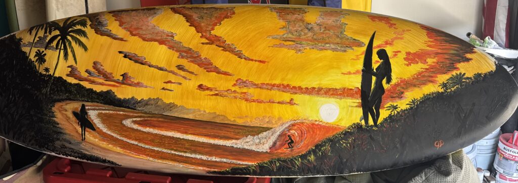
This piece was built almost entirely within a yellow-to-red range—and it still creates distance, movement, and focus. That wasn’t accidental. It was a decision to rely on structure instead of variety.
Limiting the Palette Forces Better Decisions
When you remove options, you stop hiding behind them.
No blues to push things back.
No greens to separate elements.
You’re left with:
- Value
- Saturation
- Temperature
That’s where real control lives—whether you’re painting fiberglass or working on skin.
Warm vs. Warm Still Creates Depth
Depth doesn’t require obvious contrast like warm vs. cool.
Here, it’s built through:
- Bright, open yellows near the light
- Denser oranges and reds as forms turn away
That subtle shift is enough to separate planes and create space.
On skin, the same principle applies:
- Softer, diluted tones create atmosphere
- Richer, saturated tones pull focus
Silhouettes Carry the Design
The darkest values do most of the storytelling.
They anchor the composition, guide the eye, and keep everything readable at a distance.
That matters even more in tattooing—because over time, clarity always beats complexity.
Working With the Canvas, Not Against It
The shape of the board wasn’t something to fight—it was something to follow.
- The shoreline flows with the rocker
- The wave wraps naturally across the width
- The hillside rises into the nose and tail
That’s what creates flow.
On the body, it’s the same idea:
If the design doesn’t move with the form, it won’t sit right long-term.
Focal Control Over Visual Noise
Not everything needs equal attention.
The brightest light and strongest contrast sit at the center of action.
Everything else supports it.
That hierarchy keeps the piece readable instead of overwhelming.
Where This Fits Alongside Other Styles
There are artists doing incredible work with bold, high-contrast color—especially in modern and neo-traditional styles. That approach has its own strengths, especially when it comes to immediate impact and stylization.
This isn’t about replacing that. It’s about offering another approach.
A more controlled palette relies less on color separation and more on value and structure—which can help a piece stay readable as it heals and ages.
Different tools. Same goal: making work that holds up over time.
Closing thoughts
You don’t need more colors.
You need more control over the ones you use.
Whether it’s a surfboard or skin, the principles stay the same—the surface just changes.
Leave a Reply