
From Line to Life: Adding Color Without Losing the Tattoo
There’s a moment every artist hits when stepping into color—an almost instinctive urge to fill everything. Every petal, every leaf, every open space gets treated like unfinished business. Saturate it all. Make it bold. Make it solid.
And that’s exactly where things can quietly go wrong.
Color, when overused, doesn’t elevate a tattoo—it flattens it. It buries your linework, muddies your contrast, and erases the breathing room that gives a design its life.
If you’ve already learned the discipline of not overshading your work, this is the same principle—just in a different language.
—
The Foundation: Respect the Linework
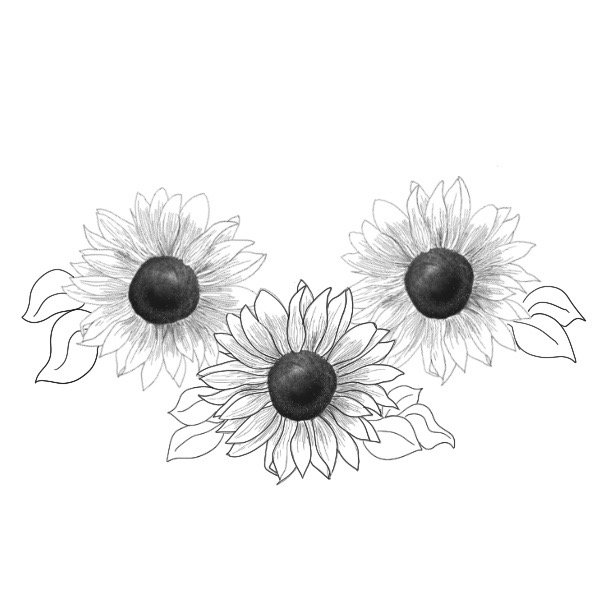
Before a single drop of color touches the skin, the line work has to stand on its own. Clean, intentional lines aren’t just structure—they’re the framework that everything else depends on.
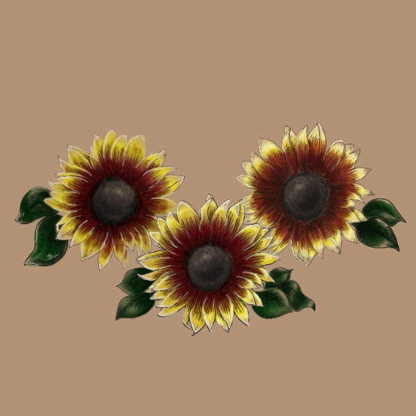
When I look at a black and negative space piece, like the sunflower design I’m currently working on, I don’t see something incomplete. I see a finished piece that can be enhanced.
That mindset matters.
Because if you treat color like a requirement instead of an enhancement, you’ll overpower the very thing that made the design strong to begin with.
Depending on if your going for realism, traditional, or a neo-traditional mix, will determine the line weight
—
Step One: Identify Your Natural Light
Every design already has a built-in light source, whether you planned it consciously or not.
In these sunflowers, the petals naturally radiate outward, and the center pulls depth inward. That alone tells you where your highlights and fades should live.
Before adding color, take a step back and ask:
– Where would light naturally hit this design?
– Where would it fall off?
Those answers will guide where color belongs—and more importantly, where it doesn’t.
—
Step Two: Use Skin Breaks as a Tool, Not an Afterthought
Skin breaks aren’t empty space. They’re intentional contrast.
When you leave areas untouched, you’re creating highlights that no ink can replicate. It keeps the tattoo breathable and prevents it from becoming visually heavy.

In the sunflower piece:
– The outer edges of some petals are left open to create a soft fade into skin
– Certain inner petal overlaps stay lighter to suggest dimension
– Not every petal is treated equally—variation is what creates realism and flow
If everything is colored, nothing stands out.
—
Step Three: Fade, Don’t Fill
Instead of packing color wall-to-wall, think in gradients.
Let your color:
– Start rich near the base or center
– Gradually soften as it moves outward
– Disappear into skin where it makes sense
This approach does two things:
1. It preserves your linework instead of drowning it
2. It creates movement within the tattoo
In the sunflowers, that means deeper golds and oranges near the center, easing into lighter yellows—and in some places, no color at all.
—
Step Four: Choose Colors with Intention
Color choice isn’t just about what looks “right” for the subject—it’s about how it supports the design.
For these sunflowers:
– Warm yellows and muted golds keep the piece grounded and natural
– Slight shifts in tone between petals prevent the design from feeling flat
– The centers remain darker to anchor the composition and maintain contrast
The goal isn’t to make the tattoo louder. It’s to make it more dimensional.
—
Step Five: Know When to Stop
This is the hardest part.
There’s always a temptation to go back in and “finish” areas that were intentionally left open. But restraint is what separates a clean, dynamic tattoo from an overworked one.
When the design feels balanced—when your eye moves naturally across it without getting stuck—that’s your signal.
Not every space needs your attention.
—
Bringing It All Together
Adding color isn’t about covering what you’ve already done. It’s about revealing more of it.
A strong tattoo doesn’t rely on saturation—it relies on contrast, intention, and control.
The same discipline you used to avoid overshading applies here:
– Protect your linework
– Respect your negative space
– Use color to guide the eye, not overwhelm it
If you can do that, color stops being something you “add”… and starts becoming something you build with.
And that’s where your work starts to stand apart.
Leave a Reply